
Appearance
Sunburst
Show a hierarchy as concentric rings. Inner segments represent broader groups; outer segments show their descendants. Segment size represents the measure, while the path from the center outward identifies the hierarchy.
Build a hierarchy view
- Add Components → Charts → Proportion → Sunburst (a new sunburst is 400 × 300 px) and choose an Analysis model in Data.
- Add the hierarchy dimensions to Axis in parent-to-child order. For example, use Product Category, Product Subcategory, then Product.
- Put Net Sales in Measure and set a period in Filters.
- Start with two levels. Add another only if the outer ring still has enough room for useful labels.
Choose fields that form a meaningful hierarchy in your model. Two unrelated dimensions can create combinations, but they do not automatically become a business hierarchy. Use non-negative, additive values for a part-to-whole interpretation: a parent segment's value is the sum of its leaves.
Format rings and labels
| Option (Style) | Effect | Default |
|---|---|---|
| Position → Horizontal, Vertical | Position of the center in the component, in percent. | 50%, 50% |
| Plot area → Diameter | Size of the chart, 50–100%. Leave space around the perimeter for labels. | 95% |
| Plot area → Hole diameter | Size of the hollow in the center, 0–30%. 0 means no hole. | 0% |
| Data labels → Show labels | Segment labels. | On |
| Data labels → Font | Font of the labels. | |
| Data labels → Color by parent | Child segments use shades of their parent's color, from darker to lighter, so each branch reads as one group. Off: each segment takes the next palette color. | On for new sunbursts; off in reports from earlier versions |
| Data labels → Trailing label | Places the labels of the outermost ring outside the chart; allow enough padding. | Off |
| Tooltip → Show Tooltip | Hover tooltip; see Tooltips. | On |
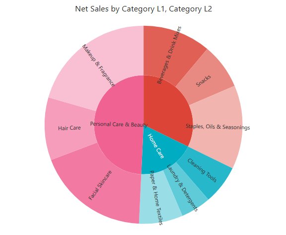
Color by parent keeps working after you change the color scheme; see Colors and Color Schemes.
Keep the tooltip on when segments are too narrow to label. Do not reduce the entire chart to unreadably small text just to display every leaf name. A parent segment's tooltip shows its total in the same format as the leaves, for example 2,508,880.81.
When you resize the component, the chart recenters and fits the new size without querying again, and the current drill level is kept.
Read a branch
Follow one inner segment outward to see how its contribution is divided. Compare siblings at the same hierarchy level. A child's share of its parent and its share of the entire chart answer different questions; check the tooltip's proportion context before quoting a percentage.
If a branch looks unexpectedly large, check field order and whether its measure is additive. If leaves are missing or illegible, reduce depth, filter the data, or enlarge the component.
Use Grouped donuts for parallel group compositions and Treemap for a compact rectangular hierarchy view.