
Appearance
Calendar chart
Show a daily measure on a calendar to reveal weekday patterns, busy periods and gaps. It is useful for daily sales, incidents or attendance. Use a line chart when precise change between dates is the main question.
Bind daily data
- Add Components → Charts → Distribution & correlation → Calendar chart (a new calendar is 800 × 260 px) and choose an Analysis model in Data.
- Put a day-level date field in Date and the daily metric in Measure.
- Set Filters to the period you want to display. Add supporting values to Tooltips if needed.
- Leave Color empty when you want the color to represent the measure.
Date lists only day-level fields that have a date format in the model. Month-level and second-level fields are not offered. If the model has no such field, the picker shows There is no valid date field in the analysis model. When several fields have the same name, the list adds the hierarchy, for example Day › Day and Date hierarchy › Day. Multiple records for one day follow the measure's aggregation. Check that the date field and any timezone handling in the source match the business day.
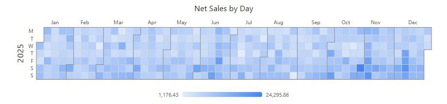
Layout and range
All in Style → Plot area:
| Option | Effect | Default |
|---|---|---|
| Layout type | Auto uses whichever of Horizontal and Vertical gives larger cells. Vertical places the years side by side. | Auto for new calendars; Horizontal in reports from earlier versions |
| Display range | Whole year draws each year in full. Data range draws from the first to the last day with data: one calendar if the span is a year or less (also across a year boundary), otherwise one row per year. | Data range for new calendars; Whole year in reports from earlier versions |
| Month separator | Line between months. | 1 px, grey, solid |
| Cell grid | Border of each day cell. | 1 px, light grey, solid |
| Cell background color | Color of days without a value. | Transparent for new calendars; white in reports from earlier versions |
| Color by value | Shades the cells by the measure and shows a color scale; see below. Off: every day with a value has the same color. | On for new calendars; off in reports from earlier versions |
Cells are always square: their side is the smaller of the two directions, in whole pixels, at most 40 px. The calendar is centered horizontally and aligned to the top of the component. If cells become too small, shorten the period or enlarge the component.
The Year, Month and Weekday groups each have Show and Font. On small cells, month labels are thinned to every other month, then to quarter starts (Jan, Apr, Jul, Oct), then hidden; weekday labels go to Mon, Wed and Fri, then are hidden. They come back when you enlarge the component. With several calendars and year labels turned off, the first month label of each calendar includes the year, for example Jan 2025.
Colors
With Color by value on and no Color field:
| Data | Scale |
|---|---|
| Positive values | From the report palette's first color (largest values) to that color mixed with 85% white (smallest). |
| Negative and positive values | Diverging, symmetric around 0: red for negative values, light grey at 0, the palette color for positive values. The ends are labelled ±max. |
| All values ≤ 0 | The more negative, the deeper the red. |
| No values, or all values equal | A single color. |
If one day dominates the colors, inspect its value before treating the remaining pale cells as unimportant.
The color scale under the chart is labelled in the measure's format, for example 24K or 5,686.77, and a marker shows the hovered value. In a narrow component the scale bar shrinks and drops its end labels; a segmented legend drops items from the end and shows +N. Change the palette in Colors and Color Schemes. There are no separate minimum and maximum color settings.
When a Color field is bound, its colors are used and Color by value has no effect, even though it stays on. The legend explains the colors but cannot be clicked:
- a measure: a gradient bar with the field name at the low end;
- color rules: the rule colors in use plus Other values;
- a dimension: its members and their colors.
Empty days, zero and tooltips
A day with the value 0 is a colored cell. A day without a value, because the query returns nothing for it or returns null, shows the cell background. Check whether the model returns zero for a day and whether filters excluded it before interpreting a blank weekend as a drop.
The tooltip shows the date with its weekday, for example 2025-03-26 Wed, and the value. A day without a value shows ‹date› ‹weekday› and ‹measure› No data. Style → Tooltip → Show Tooltip (default on) turns tooltips off.
Clicking a day filters the other components on the page; the selected day gets a dark 2 px outline until the selection is cleared. See Cross-filtering.
Opening reports made before 10.00
- Cells are square now. Calendars whose cells were stretched (for example 18.4 × 28 px) look different.
- Days with the value 0 are colored instead of left blank.