
Appearance
Heat matrix
Cross two dimensions and use cell colour to compare a measure. A heat matrix helps find patterns across region and product, day and hour, or team and metric category. It is new in 10.00.
Build regional category sales
- In Components → Charts → Distribution & correlation, add Heat matrix and select an Analysis model in Data.
- Set X axis to Region, Y axis to Category L1 and Measure to Net Sales. Use equivalent fields in your model.
- Set Filters to Year = 2025. Each cell now holds sales for one region and category.
- Add optional fields to Tooltips. Check the values before choosing the colour scale.
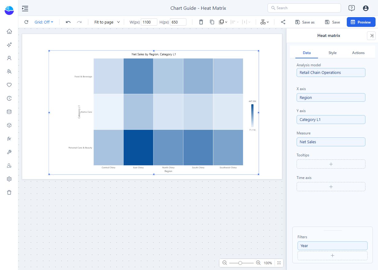
Each slot takes one field. There is no Color slot: colour always comes from the measure and the colour scale. The X axis supports drill down; the Y axis does not. Prefer a row limit on X: a row limit on Y keeps the top items within each X member and leaves the matrix ragged.
A new heat matrix is placed at 400 × 300 px, shows the X-axis name, and has data-label Display units set to Auto.
Choose what colours compare
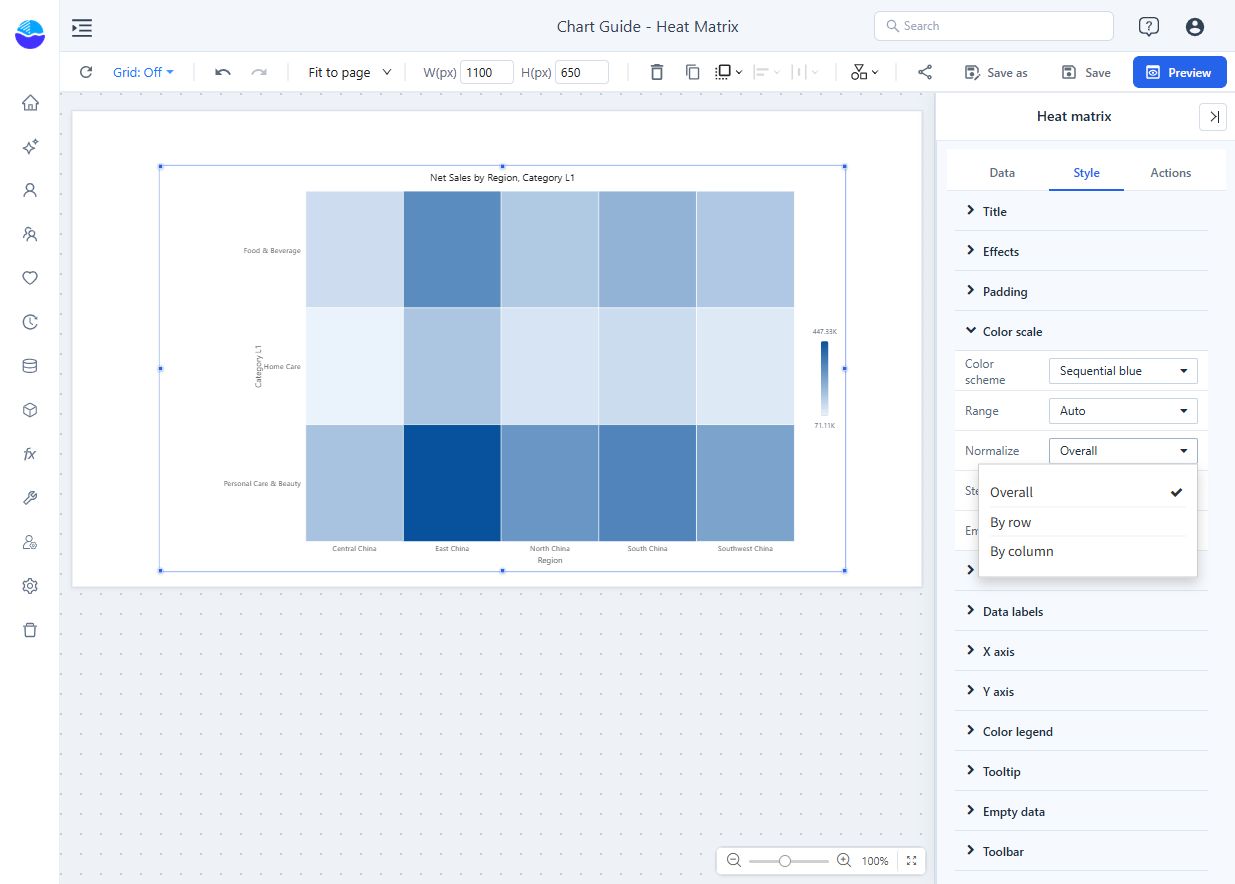
Open Style → Color scale → Normalize.
| Mode | Meaning of the darkest cell |
|---|---|
| Overall (default) | High relative to all cells. Use for absolute comparisons. |
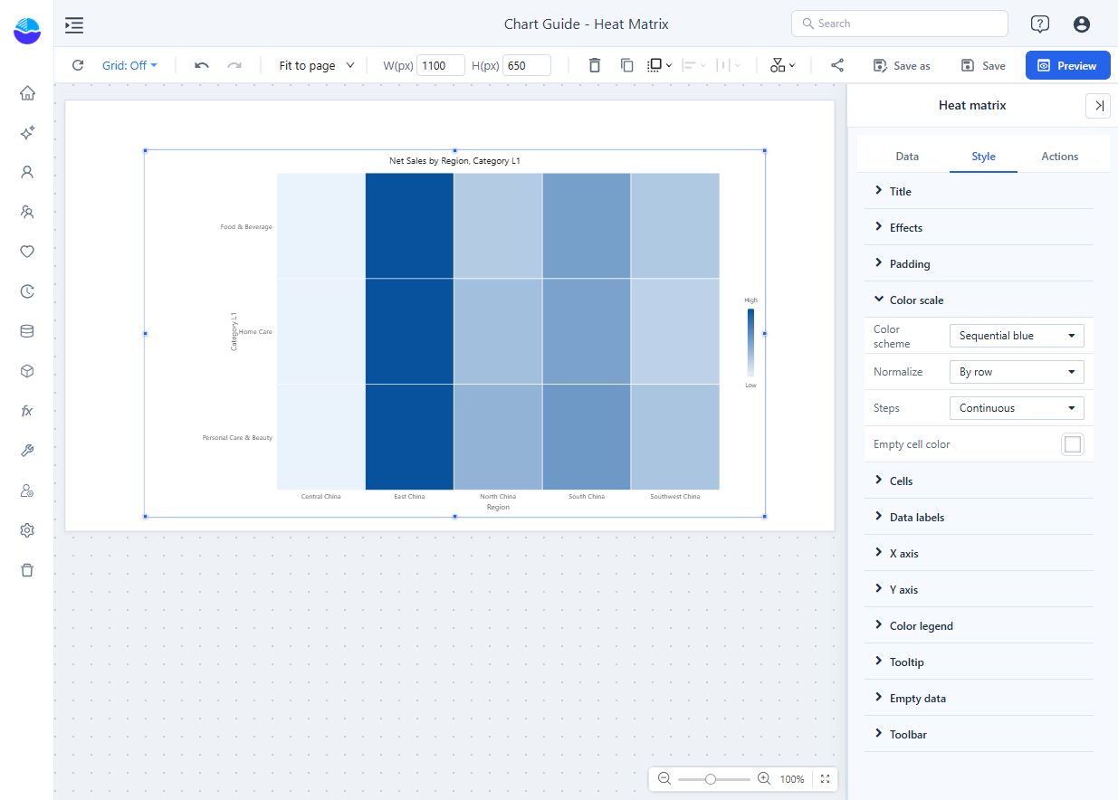
| By row | High within its own row. In this example, the strongest region for each category. |
| By column | High within its own column. In this example, the strongest category within each region. |
Normalisation changes colours only: with By row or By column, two equally dark cells need not have equal values, the colour legend reads Low–High, and the tooltip still shows the raw value. If a dark cell holds an unexpectedly small value, check the normalisation mode before assuming a calculation error, and change the mode only when you mean to change the comparison question.
With By row, the same data shows East China as the darkest cell in every category row, although Home Care sales are much lower than Personal Care & Beauty sales:
Color scale settings
| Setting | Effect | Default |
|---|---|---|
| Color scheme | Sequential blue, Sequential green, Sequential orange, Sequential purple, Diverging (blue–white–red), Diverging (red–yellow–green) or Custom. | Sequential blue |
| Minimum color, Middle color, Maximum color | Shown for Custom. A transparent middle colour gives a two-colour gradient. | Light blue, transparent, dark blue |
| Range | Auto: data minimum to maximum. Fixed: the Minimum and Maximum you enter (swapped if reversed). Shown only with Normalize → Overall. | Auto |
| Midpoint | Value that gets the middle colour. Shown for diverging schemes (or Custom with a middle colour) with Normalize → Overall; also used with a fixed range. Empty = halfway between the data minimum and maximum. | Empty |
| Steps | Continuous, or 3–9 colour steps. Automatic step boundaries are rounded to readable numbers (1, 1.5, 2, 2.5, 3, 4, 5, 6 or 8 times a power of ten). | Continuous |
| Empty cell color | Background of cells without a value, drawn with light diagonal stripes. | White |
Use Fixed to keep colours comparable across charts or filter states. Use a diverging scheme only when values spread around a meaningful midpoint, such as zero variance. Do not rely on red and green alone to communicate status.
Make cells readable
| Setting | Effect | Default |
|---|---|---|
| Cells → Gap | Space between cells, 0–8 px. | 1 px |
| Cells → Corner radius | 0–8 px. | 0 px |
| Data labels → Show | Values in the cells. Labels that do not fit their cell are not drawn. | Off |
| Data labels → Font size | 8–20 px. | 11 px |
| Data labels → Display units, Decimal places | See Display Units and Decimal Places. | Auto for new charts |
| Data labels → Auto contrast | White text on dark cells, dark text on light cells, following the step colours. | On |
| X axis order, Y axis order | Query order, Name ascending, Name descending, Total ascending, Total descending. The total is the row or column sum and is used only for sorting. | Query order |
| Color legend → Show color legend | Shows how colours map to values. | On |
| Color legend → Position | Right or Bottom. | Right |
| Tooltip → Show Tooltip | Turns the hover tooltip on or off. | On |
The Y axis runs from top to bottom. Overlapping X labels are hidden; for long names use X axis → Rotate labels.
How it behaves
- The tooltip lists the X member, the Y member, the measure value and any Tooltips fields.
- Cells without a value show (Blank) in the tooltip and cannot be clicked. They differ from a measured zero.
- The axes never scroll: with many members the cells get smaller. The data point limit counts cells.
- There is no Analytics tab, so no reference lines.
Related: Calendar chart · Top/Bottom N · Tooltips · Empty Data and Error Messages