
Appearance
Range column
Show a lower and upper value for each category. A column spans the interval between them, rather than starting at zero. Use it for observed minimum/maximum values, planned ranges or other clearly defined bounds.
Build a range comparison
- Add Components → Charts → Column & bar → Range column (a new range column is 400 × 300 px) and choose an Analysis model in Data.
- Put the category, such as Product, in Category field.
- Put the lower-bound measure in Minimum value and the upper-bound measure in Maximum value.
- Set Filters to a common period and population. Add optional Tooltips fields for context.
For example, use Minimum Selling Price and Maximum Selling Price by Product. Both measures must use the same units, and the lower value should not exceed the upper value. Prepare the intended minimum/maximum aggregations in the model instead of assuming that any two numeric fields define those statistics.
The automatic title names both measures and the category. The default Y-axis name is ‹minimum measure› and ‹maximum measure›.
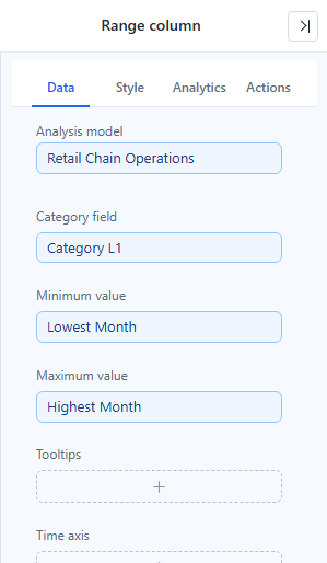
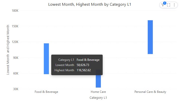
Here both measures are report-level calculated measures, such as Min([Date].[year_month].[year_month].Members, [Measures].[Net Sales]).
Read the interval
The lower endpoint is the minimum, the upper endpoint is the maximum, and their difference is the range. A tall range column means a wide interval; it does not mean a large total. Two columns can have the same height but different absolute levels. The automatic value axis follows the data and does not have to start at 0.
If a range is reversed or absent, inspect the source values and measure definitions. If the endpoints are identical, a collapsed interval may be a valid zero-width range. Do not label the range as uncertainty or a confidence interval unless those are actually the statistics supplied by the data.
Format the columns
| Option (Style) | Effect | Default |
|---|---|---|
| Bar → Bar width | Width of the column in pixels, 1–40. | 20 px for new range columns; 1.5 px in reports from earlier versions |
| Bar → Cap width | Width of the end caps relative to the bar width, 0–500% in steps of 50. 0 makes the caps as wide as the column. | 0% for new range columns; 200% in reports from earlier versions |
| Data labels → Show, Font | Labels at both ends of each column. | On |
| X axis, Y axis | Category labels; value scale, units and axis name. | |
| Zoom slider → Zoom | Adds a slider to zoom the axis range. | Off |
| Tooltip → Show Tooltip | Hover tooltip with both endpoint values; see Tooltips. | On |
A narrow Bar width with wide caps draws an error-bar style line; a wide bar with Cap width 0 draws a plain floating column. When a low label would overlap the category names near the bottom of the axis, it is placed to the right of the endpoint.
The range column has no Display units setting; change the measure's format instead. The Analytics tab adds reference lines and bands; statistics use the raw minimum and maximum measures over all points. See Reference lines.
Opening reports made before 10.00
- Cap width was called Overflow margin.
- The low end of each column is labelled again; earlier versions labelled only the maximum.
- An automatic Y-axis name reads A and B instead of A~B.
Use Box plot for median, quartiles and outliers, or Clustered column to compare two separate measures without implying an interval.