
Appearance
Icon
Icon shows a font icon or an SVG file. It replaces the Font icon and SVG components of earlier versions.
In Components → Assists, click Icon, then click the canvas. A new icon is a star, 64 × 64 px.
In Style → Icon, choose Icon source:
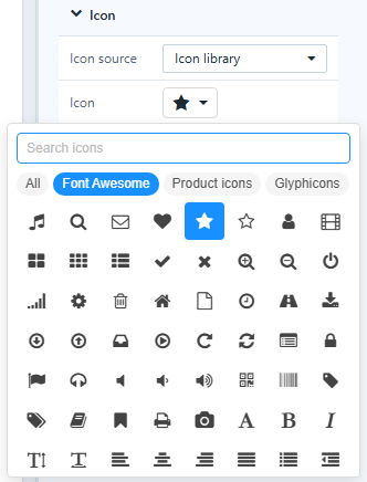
- Icon library: click Icon to open the picker, then Search icons or browse All, Font Awesome, Product icons and Glyphicons (862 icons).
- Upload SVG: choose an SVG file. Scripts and event attributes are removed; the file is saved with the report.
Set the look:
| Setting | Options |
|---|---|
| Color | Single color or, for SVG, Original colors |
| Size&Color | Size and colour of the icon |
| Scale with component | The icon grows with the component (on for new icons) |
| Position, Rotate, Flip | Placement in the frame, rotation, flip horizontally, vertically or both |
| Background shape | None, Circle or Rounded square, with Shape color |
Tooltip
Style → Tooltips holds a formatted tooltip, shown when readers rest the pointer on the icon. Readers can move into the tooltip and click its links; HTML scripts are removed. Use it for definitions next to a KPI, such as Net Sales excludes returns.
Actions
Click action and Visibility. See Click Actions and Visibility.
Old SVG components keep working; they are no longer in the palette.