
Appearance
Funnel
Show values across process stages, such as leads, qualified leads, proposals and wins. A process funnel requires a meaningful stage order and comparable values. A funnel-shaped ranking of unrelated categories does not establish a conversion process; use a Clustered bar to rank unrelated categories.
Bind the stages
- Add Components → Charts → Flow & breakdown → Funnel (a new funnel is 400 × 300 px) and choose an Analysis model in Data.
- Put the stage dimension in Field and the stage count or amount in Measures, for example Opportunity Count.
- Apply Filters for a consistent cohort and period. Confirm that each stage represents the same population moving through the process.
- Put the stages in business order with Stage order → Adjust: drag a row or use the arrows, then confirm.
| Stages come from | Bind | Notes |
|---|---|---|
| Members of a dimension | One field in Field, one measure in Measures | With a field bound, Measures takes one measure. |
| Separate measures | Several measures in Measures | Field is hidden; each measure is one stage. Check that the measures share a unit. |
Do not mix a count, a rate and a currency amount and then interpret their ratios as conversion.
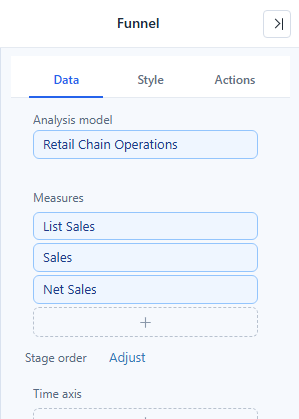
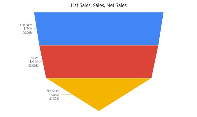
The Stage order dialog lists the stages in their current order. Not in current data marks stages that the current filters do not return; they are not visible zero stages. Reset to default order restores the query order. If the funnel is sorted by value, the button reads Use stage order, and the dialog's Switch to stage order when confirmed switch (on by default) changes the arrangement when you confirm. When separate measures are the stages, the dialog lists the measures, and confirming reorders the Measures box.
Choose arrangement before interpreting percentages
Under Style → Plot area → Arrangement:
| Arrangement | Result |
|---|---|
| Stage order | Keeps the order of the members or measures and calculates percentages along it. Use for conversion analysis. Default for new funnels. |
| Funnel (by value, high to low) | Ranks stages by value. The visual order can differ from the business process. Default in reports from earlier versions. |
| Pyramid (by value, low to high) | Ranks stages by value and draws them bottom-up. Read the direction carefully. |
A value-sorted arrangement overrides the stage order you adjusted. With Stage order and no adjustment, stages come in query order (often alphabetical), so the shape can look like a diamond rather than a funnel; adjust the order instead of switching to a value sort.
Each stage keeps its color when you change the arrangement: colors follow the stage's position in the query order, not its drawn position, so a member has the same color as in other charts on the page. See Colors and Color Schemes.
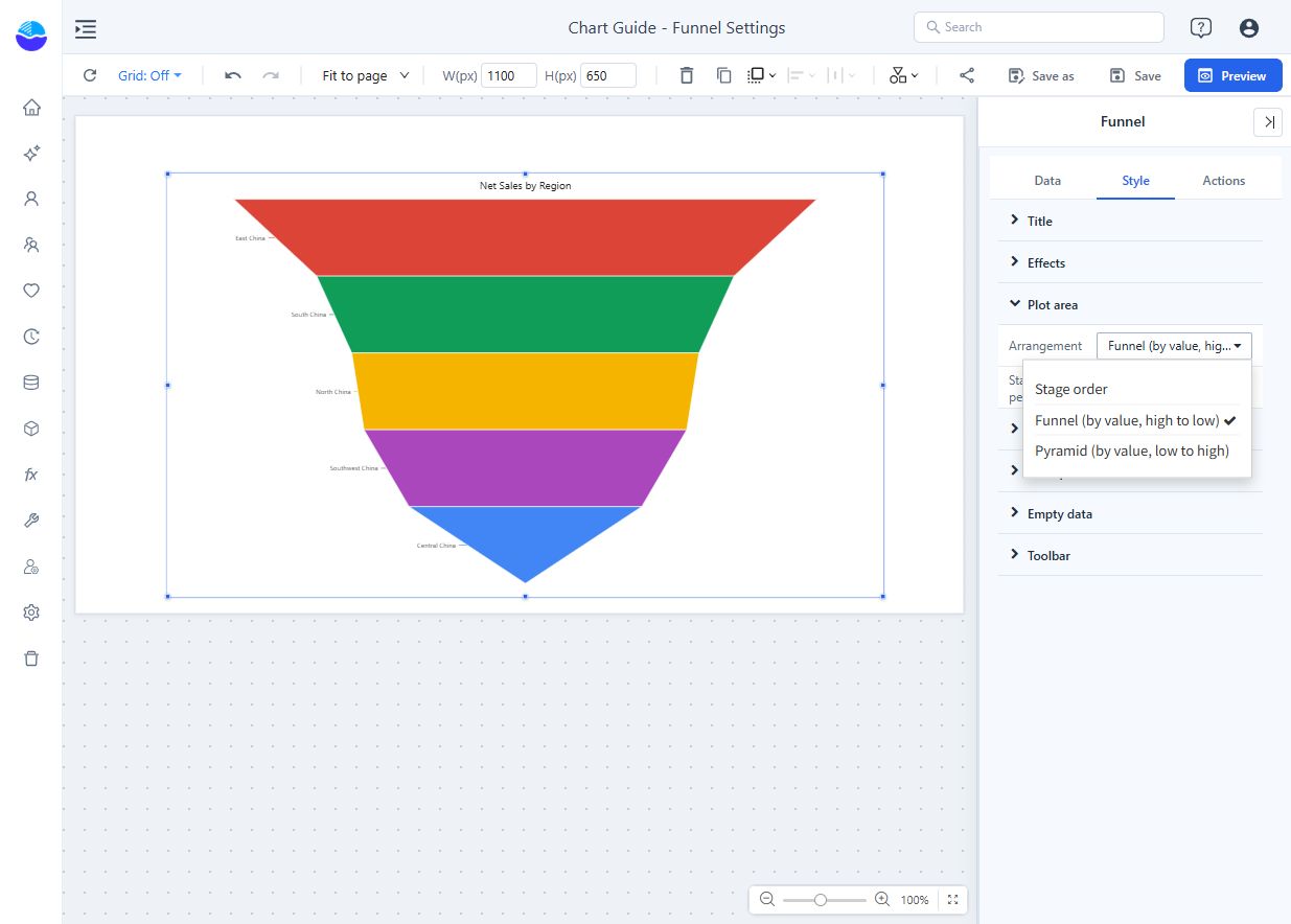
This settings example ranks regional sales and uses No percentages. Regions are not process stages, so the example is not a conversion funnel.
Configure stage percentages
Style → Plot area → Stage percentages controls whether ratios are calculated:
| Option | Effect |
|---|---|
| Auto (default) | No percentages when the measure is a percentage or an average-like statistic, or when stages use different currencies or units. Otherwise percentages are calculated, but the basis is not verified. |
| Always calculate | Skips the check. Use only after confirming that the stages are comparable. |
| No percentages | For stages that are not comparable, such as a ranked-value display. |
Percentages always appear in the tooltip. To show them on the chart, tick vs previous or vs first in Style → Data labels → Label contents. vs previous compares with the preceding stage; vs first compares with the starting stage. Stages of 1,000, 600 and 300 give 50% from the second to the third stage, but 30% from the first to the third: the denominators differ. The first stage has no "vs previous" line.
When a percentage cannot be calculated, the tooltip shows "—" with the reason, for example The base stage is 0, Negative values cannot form a percentage or Percentages are turned off. Do not read an unavailable percentage as 0%. If conversion exceeds 100%, check cohort definitions, repeated entities, stage order and date filters before assuming a product error.
Data labels
| Option (Style → Data labels) | Effect | Default |
|---|---|---|
| Show | Shows the labels. | On |
| Font | Size, color and style. | Dark grey |
| Position | Left, Center or Right of the stage. | Left |
| Label contents | Any of Name, Value, vs previous, vs first; at least one. | Name + Value for new funnels; Name, Value and vs first in reports from earlier versions |
| Display units, Decimal places | Unit and decimals of the values; see Display units and decimal places. | Auto for new funnels; Follow measure format in reports from earlier versions |
Labels get the space they need on their side, and the funnel keeps at least 40% of the width. A label that still does not fit is truncated, with the full text in the tooltip; labels that overlap are hidden. With Position → Center and the default font colour, labels switch to white text with an outline for contrast.
Style → Tooltip → Show Tooltip (default on) turns the hover tooltip off; see Tooltips.
Opening reports made before 10.00
- Labels are dark grey instead of the stage colour. Set Font colour to restore a colour.
- Stage percentages → Auto hides the ratios when the stages are averages or percentages, or use different currencies or units. Choose Always calculate to show them anyway.
- Stage colors no longer change when you switch the arrangement.
- The first stage no longer shows "vs previous: —".
Related: Sankey · Cross-filtering · Adding Components