
Appearance
Box plot
Compare the spread of a measure across observations, optionally separated into groups. For example, compare the distribution of store sales in each region rather than only each region's total. Box plot is new in 10.00.

Choose the observation first
- In Components → Charts → Distribution & correlation, add Box plot and select an Analysis model in Data.
- Bind Sample to Product, Group to Region and Measure to Net Sales.
- Set Filters, such as Year = 2025. Each product contributes its sales in the region for that period as one observation.
- Add supporting fields to Tooltips if needed. Omit Group for a single box.
| Slot | Takes | Notes |
|---|---|---|
| Sample | Dimension, required | Each member is one observation. Until it is filled the chart stays unconfigured and runs no query. |
| Group | Dimension, optional | One box per member. Not drillable. |
| Measure | One measure | The value of each sample. |
| Tooltips | Optional fields | Shown on outlier and point tooltips only, not on the box tooltip. |
There is no Color slot. Sample defines the observation grain: Store gives a distribution of store-level values, an order identifier gives a different one. The chart does not use individual source rows unless the Sample field is that fine. Avoid a row limit on Sample: it silently removes observations and changes the distribution.
The example below uses Retail Chain Operations, Product as Sample, Region as Group, Net Sales as Measure and Year = 2025. Each observation is one product's 2025 sales in a region, so every region has enough observations for a box. With Store as Sample instead, most regions have fewer than five stores and appear as individual points, which are not outliers.
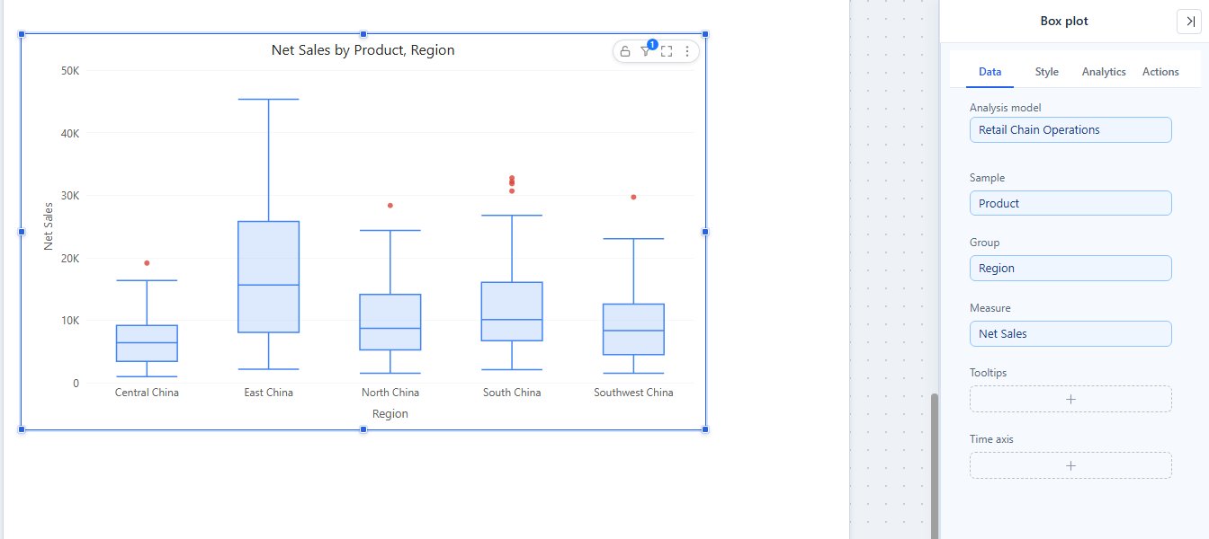
A new box plot is placed at 400 × 300 px, with Display units set to Auto.
Read the box
The box spans the lower to the upper quartile, covering the middle half of the observations; the line inside marks the median. Quartiles use linear interpolation (the method of Excel's QUARTILE.INC). Empty samples are ignored. A group with fewer than 5 samples is drawn as points only, and its tooltip says Fewer than 5 samples; shown as points only.
Open Style → Box → Whiskers:
| Rule | Whiskers end at | Outliers |
|---|---|---|
| 1.5 × IQR (default) | The most extreme samples within 1.5 × the interquartile range beyond the quartiles. | Samples beyond that. |
| Min to max | The smallest and largest samples. | None. |
| 5th to 95th percentile | The 5th and 95th percentiles: a central 90% range. | The samples beyond, so there are almost always some. |
| 10th to 90th percentile | The 10th and 90th percentiles: a central 80% range. | As above. |
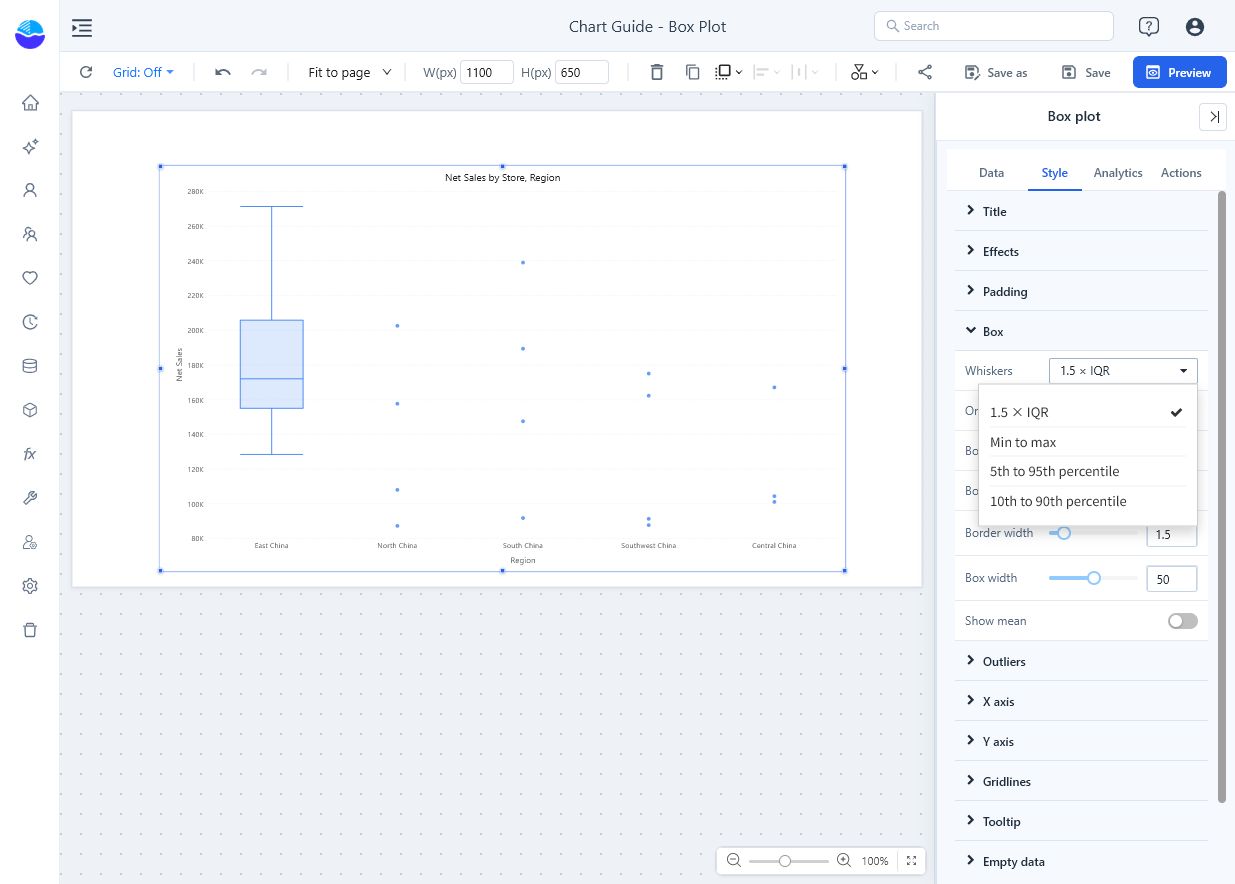
Keep the same rule across the groups you compare. A point marked as an outlier is not automatically a data error.
Settings that matter
All in the Style tab.
| Setting | Effect | Default |
|---|---|---|
| Box → Orientation | Vertical or Horizontal boxes. In horizontal mode Y-axis min value and Y-axis max value set the horizontal value axis. | Vertical |
| Box → Box color, Border color | Fill, and the colour of the box outline, median line and whiskers. Fixed colours, not the page palette. | Light blue, blue |
| Box → Border width | 1–4 px. | 1.5 px |
| Box → Box width | Share of each group's slot, 10–90%. | 50% |
| Box → Show mean | Marks the mean with a diamond. | Off |
| Outliers → Show outliers | Draws samples beyond the whiskers as points. Hiding them does not change the statistics. | On |
| Outliers → Outlier size, Outlier color | 3–14 px; colour of the points. | 6 px, red |
| Outliers → Display units, Decimal places | Format of every number in the tooltips: box statistics, outliers and points of small groups. See Display Units and Decimal Places. | Auto for new charts |
In the Analytics tab you can add fixed lines and bands; statistic lines are not available. See Reference lines.
Tooltips
| Hovered | Shows |
|---|---|
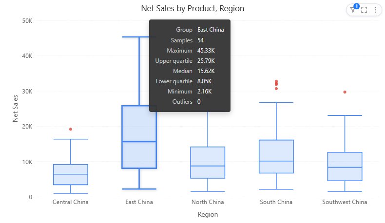
| A box | Group, Samples, Maximum, Upper quartile, Median, Lower quartile, Minimum, Mean (when shown) and Outliers (count). |
| An outlier or a point | Group, Sample, Value and the Tooltips fields. |
Maximum and Minimum are the largest and smallest samples, not the whisker ends; the whisker ends are not listed. Clicking a box keeps that group's outliers and mean highlighted.
Example result
In the example, the box tooltip of East China shows 54 samples, a median of 15.62K, lower and upper quartiles of 8.05K / 25.79K, a maximum of 45.33K and 0 outliers; South China and Southwest China have outliers above their whiskers. These are the chart's rounded display values.
- Small groups appear as points instead of a box; check the sample count before comparing their spread.
- Every box collapses to a line: check whether the observations really are identical, or whether the Sample field is too coarse.
- Many groups crowd the axis: there is no scrollbar, and the data point limit counts boxes plus points. Filter to fewer groups.
Related: Histogram for the shape of one distribution · Scatter to compare two measures observation by observation · Tooltips