
Appearance
Choose a chart
Start with the question and the data you have, then choose the chart. Example field names are illustrative; use equivalent fields from your analysis model. To place a chart and fill its fields, see Adding components.
Choose by question and data
| Question | Data you have | Use | Choose the alternative when |
|---|---|---|---|
| What is the current result? | One measure, optionally reference measures | Measure card | Readers also need the trend: a KPI trend card with a period field. |
| Are we meeting a target? | A measure and a target (measure or fixed number) per category | Bullet | One value on a scale with ticks: Gauge. One completion ratio: Ring progress. |
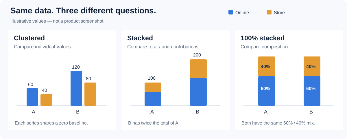
| Which category is largest? | A category dimension and a measure | Clustered column | Long names or many categories: Clustered bar. |
| What contributes to the total? | A category, and an additive measure split by a Legend field (or several part measures) | Stacked column and bar | One series must be compared across categories: a clustered column or bar. |
| How does the mix differ? | A category and additive, non-negative parts | 100% stacked column and bar | A few slices of one whole: Pie. One whole per group: Grouped donuts. |
| How does it change over time? | An ordered date or period field and a measure | Line | Volume matters, or the series are parts of a total or shares of it: Area charts (area, stacked area, 100% stacked area). |
| How do measures with different units compare? | A category and two measures, such as sales and margin rate | Combo | Every series has the same unit and role: a line or clustered column. |
| Do two measures move together? | An observation dimension, such as Store, and two measures | Scatter | — |
| What happens on each day? | A day-level date field and a measure | Calendar chart | Precise change between dates matters: Line. |
| How are values distributed? | A row-level numeric field (a physical column) | Histogram | A sample dimension and a measure, compared across groups: Box plot. A low and a high measure per category: Range column. |
| Where are the patterns across two dimensions? | Two dimensions and a measure | Heat matrix | Exact values matter more than the pattern: a Pivot table. |
| How do profiles compare across criteria? | 3–8 criteria on one comparable scale, and a measure | Radar | More criteria, many entities or mixed units: a clustered bar or a table. |
| How is a hierarchy divided? | Parent and child dimensions and an additive measure | Treemap | The sequence of levels matters: Sunburst. Readers choose the next split: Decomposition tree. |
| How many pass each stage? | Ordered stages (members or one measure per stage) and a count | Funnel | The categories are not process stages: a clustered bar. |
| Where does a quantity flow? | A source, a target and a non-negative weight | Sankey | The relationship is only parent and child: Sunburst. |
| How does a balance build up? | Ordered steps and signed changes | Waterfall | You have ending balances, not changes: Line. |
| Where does it happen, by region? | Region names or codes | Filled map | Markers sized by value: Marker map. Both use the built-in region maps and need no online map service. |
| Where does it happen, by address or coordinates? | Place names, or longitude and latitude | GIS marker map on an OpenStreetMap or Google basemap | Point density: GIS heat map. A Mapbox or Amap basemap: Mapbox/Amap. All three need an online map service, see GIS Map Settings. |
| Where is it on a floor plan or picture? | X/Y positions on your own image | Image map | — |
| Which exact values do readers need? | Any fields | Table | Cross-tabulated totals: Pivot table. A hierarchy: Tree table or Parent-child table. |
| What context should the reader see? | A dimension, words with weights, or image references | Dimension field | Category weight at a glance: Word cloud. A picture per item: Dynamic image. |
Limits that often decide the choice:
- Many categories or close values: use a bar, not a pie. A pie reads well with a few slices.
- Criteria for a radar: about 3–8, all on one scale with the same desirable direction.
- One value: use a card, not a chart with a single column.
- An amount and a rate: a single value axis shows plain numbers and squeezes the rate near zero; use a Combo with two axes.
- Distribution charts need the observation grain: the Scatter Marker, the Box plot Sample and the Histogram's row-level Value decide what one point is.
In the palette, charts are grouped as Tables, Cards & KPI, Column & bar, Line & area, Proportion, Distribution & correlation, Flow & breakdown, Maps and Other; hover a tile to see what it is for.
Resolve common data problems
Check a new chart, and any chart that looks wrong, against a table at the same grain and with the same filters: save, open Preview, hover a few categories or points and compare the values. Only then configure Style.
| Result | Check first |
|---|---|
| The value is different from a table | Same measure definition, aggregation grain, filters and included categories? |
| A total looks too large | Overlapping measures (a total stacked with its own parts), duplicated categories, or a measure aggregated at the wrong grain. |
| A rate looks wrong | Does the source store 0.42 or 42? Is the measure formatted as a percentage? Is it a ratio of totals or an average of row ratios? |
| A category is missing | Data filters, row limits, missing values and available display space. |
| A gap, blank cell or missing period | Absent data is not zero. Check the filters and whether the source returns 0 for that period. |
| A sharp change between periods | Whether categories appeared or disappeared under the current filters, and whether the last period is complete. |
| A chart does not respond to a filter | Exact model/field binding and filter subscriptions. |
| A tiny difference looks dramatic | Axis bounds, percentage normalization and color normalization. |
| Fields or series disappear after a chart-type change | Chart switch moves fields to the new chart's slots where they fit and can discard the rest. Recheck the data slots, axis units and style settings. |
| A chart is empty | Required slots, a valid model and whether any data matches the filters; the message tells you which, see Empty data and errors. Style cannot supply missing data. |
| Labels show K or M, or too few decimals | Display units and Decimal places, see Display units and decimal places. |
A pattern between two measures shows association, not cause. See component filters for chart-specific scope. Keep units, comparison periods and the meaning of color visible in the report itself.