
Appearance
Rectangle
Overview
The Rectangle component allows users to add rectangular shapes to reports or dashboards. It supports various customization options such as border styling, background color, shadows, and rounded corners.
1. Style Settings
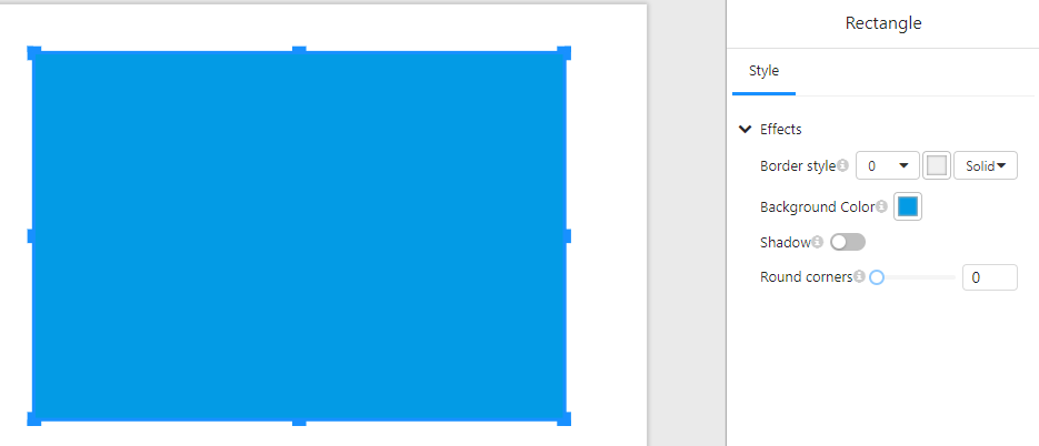
In the "Style" tab, users can configure the appearance of the rectangle:
1.1 Border Settings
- Border style: Adjust the border width using a numerical input.
- Border type: Select the style of the border (e.g., solid, dashed, dotted).
- Border color: Choose a color for the border.
1.2 Background Settings
- Background Color: Set the fill color of the rectangle.
1.3 Shadow Effect
- Shadow: Enable or disable a shadow effect around the rectangle.
1.4 Corner Rounding
- Round corners: Adjust the corner radius to create rounded edges.
2. Usage Examples
- Background Elements: Use rectangles as colored backgrounds for grouping or highlighting data.
- Buttons: Combine with click events (if supported) to create interactive buttons.
- Decorative Elements: Enhance the dashboard's appearance with different styles and colors.
3. Notes
- Ensure a good contrast between the background color and other components for better visibility.
- Using rounded corners can make the rectangle look like a button or card element.
- When shadows are enabled, ensure they complement the design without affecting readability.