
Appearance
Ellipse
Overview
The Ellipse component allows users to add an oval shape to reports or dashboards. It supports customization options such as border settings, fill color, rotation, and event actions.
1. Style Settings
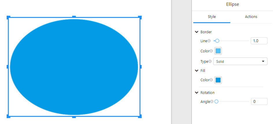
In the "Style" tab, users can configure the visual properties of the ellipse:
1.1 Border Settings
- Line: Adjust the border thickness using a slider or input field.
- Color: Select the border color.
- Type: Choose the border style, such as solid, dashed, or dotted.
1.2 Fill Settings
- Color: Set the fill color of the ellipse.
1.3 Rotation
- Angle: Rotate the ellipse by adjusting the angle value.
2. Actions Settings
In the "Actions" tab, users can configure interactive behaviors for the ellipse:
2.1 Click Event
- Click event: Define an action that occurs when the ellipse is clicked, such as navigating to a URL, triggering a function, or interacting with other components.
3. Usage Examples
- Decorative Elements: Add ellipses to enhance the visual appeal of dashboards.
- Interactive Buttons: Assign click events to make the ellipse function as a button.
- Data Highlighting: Use different colors and border styles to emphasize specific areas.
4. Notes
- Ensure that the border and fill colors contrast well for better visibility.
- When using the click event, make sure it aligns with the report's functionality.
- Rotating the ellipse may affect its alignment with other components.