
Appearance
Bullet
Overview
A Bullet Chart is a high–information-density KPI visualization designed to compare the Actual value against a Target, while displaying multiple performance thresholds (such as Satisfactory, Good, Very Good, etc.) using segmented background ranges.
As a compact and efficient alternative to gauge charts, bullet charts present rich business insights in a limited space, making them widely used in operational analytics, performance management, and financial dashboards.
When to Use
- Displaying actual KPI performance
- Comparing actual vs. target
- Using ranges to show performance levels (satisfactory / good / excellent)
- Displaying multiple KPIs simultaneously (e.g., by store, department, product)
- Replacing bulky gauge charts
Components of a Bullet Chart
A bullet chart contains the following elements:
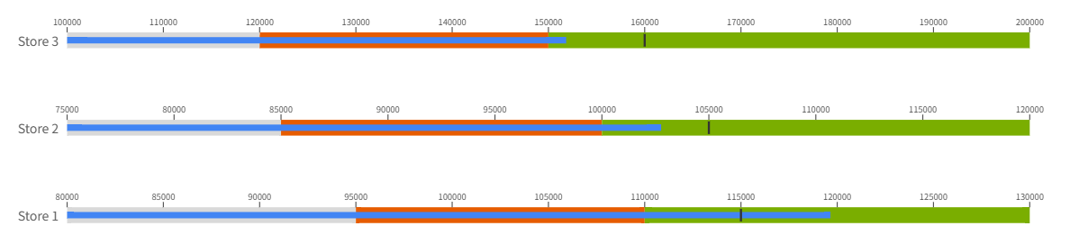
Background Ranges
Represent performance levels from low to high. Typically configured as:- Minimum
- Normal
- Satisfactory
- Good
- Very Good
- Maximum
Actual Bar
A dark bar that represents the current value of the KPI.Target Marker
A vertical line indicating the desired target.Category Label
Used to generate multiple bullet charts (e.g., Store 1, Store 2).
Data Structure
Bullet charts support binding multiple fields from the data model.
Required Fields
| Field | Description |
|---|---|
| Actual | KPI actual value (e.g., Revenue, Sales) |
| Target | Target value; also used as the base for range percent |
Optional Fields
| Field | Description |
|---|---|
| Category | Dimension for grouping (Store, Department, etc.) |
| Min Value | Start of the performance range |
| Normal | End of the first performance range |
| Satisfactory | End of the second performance range |
| Good Value | End of the third performance range |
| Very Good Value | End of the fourth performance range |
| Max Value | End of the overall performance range |
Example Dataset
| Store | Revenue | Target | Min Revenue | Satisfactory Revenue | Good Revenue | Very Good Revenue |
|---|---|---|---|---|---|---|
| Store 1 | 119645 | 115000 | 80000 | 95000 | 110000 | 130000 |
| Store 2 | 102769 | 105000 | 75000 | 85000 | 100000 | 120000 |
| Store 3 | 151845 | 160000 | 100000 | 120000 | 150000 | 200000 |
Configuring a Bullet Chart
Bullet chart configuration in Datafor includes Data, Style, and Behavior sections.
1. Data
Below is the Data binding panel for the bullet chart:
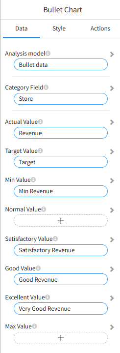
Category
Used to group the chart and generate multiple bullet charts (e.g., per Store).
Actual
Defines the bar representing the actual KPI value.
Target
Defines the target marker and acts as the base value for percentage-based ranges.
Ranges
If range fields are provided, they determine the boundaries of each performance segment.
| Field | Description |
|---|---|
| Min Value | Range starting point |
| Normal | End of the first range |
| Satisfactory | End of the second range |
| Good | End of the third range |
| Very Good | End of the fourth range |
| Max Value | Range ending point |
📌 If range fields are not provided, percentage-based ranges can be generated automatically.
2. Style
Orientation
- Horizontal (default)
- Vertical
Color Settings
You can configure colors for:
- Actual value
- Target marker
- Minimum range
- Normal range
- Satisfactory range
- Good range
- Very Good range
Range Values (Percentage Mode)
When no range fields are bound, the chart can calculate segment boundaries using percentages based on the Target value.
For example, with a target of 100,000:
- Needs Improvement (70%) → 70,000
- Normal (85%) → 85,000
- Good (100%) → 100,000
- Very Good (110%) → 110,000
Tooltip Labels
When using percentage mode, you can configure labels for:
| Option | Description |
|---|---|
| Target Label | Label for the target |
| Normal Label | Label for the Normal range |
| Satisfactory Label | Label for Satisfactory |
| Good Label | Label for Good |
| Excellent Label | Label for Very Good |
Best Practices
- Use 3–4 ranges for clear performance interpretation
- Use color gradients from lighter → darker to represent improvement
- Keep the target marker visually distinct
- Hide axis ticks when displaying many categories to reduce clutter
- If each category has a different target, bind the target as a field
- If the target is constant, set it directly in the Style → Values