
Appearance
Stacked Bar
Overview
A Stacked Bar Chart displays data using horizontal bars stacked by series. It helps visualize the total value of each category along with the individual contribution of each sub-category, making it ideal for composition analysis when vertical space is limited or when horizontal labels are more readable.
When to Use
- To analyze both total values and component contributions.
- To show part-to-whole relationships across categories.
- When your category labels are long or need more space.
- To emphasize horizontal comparisons.
Data Structure
Stacked Bar Charts support two standard data structures:
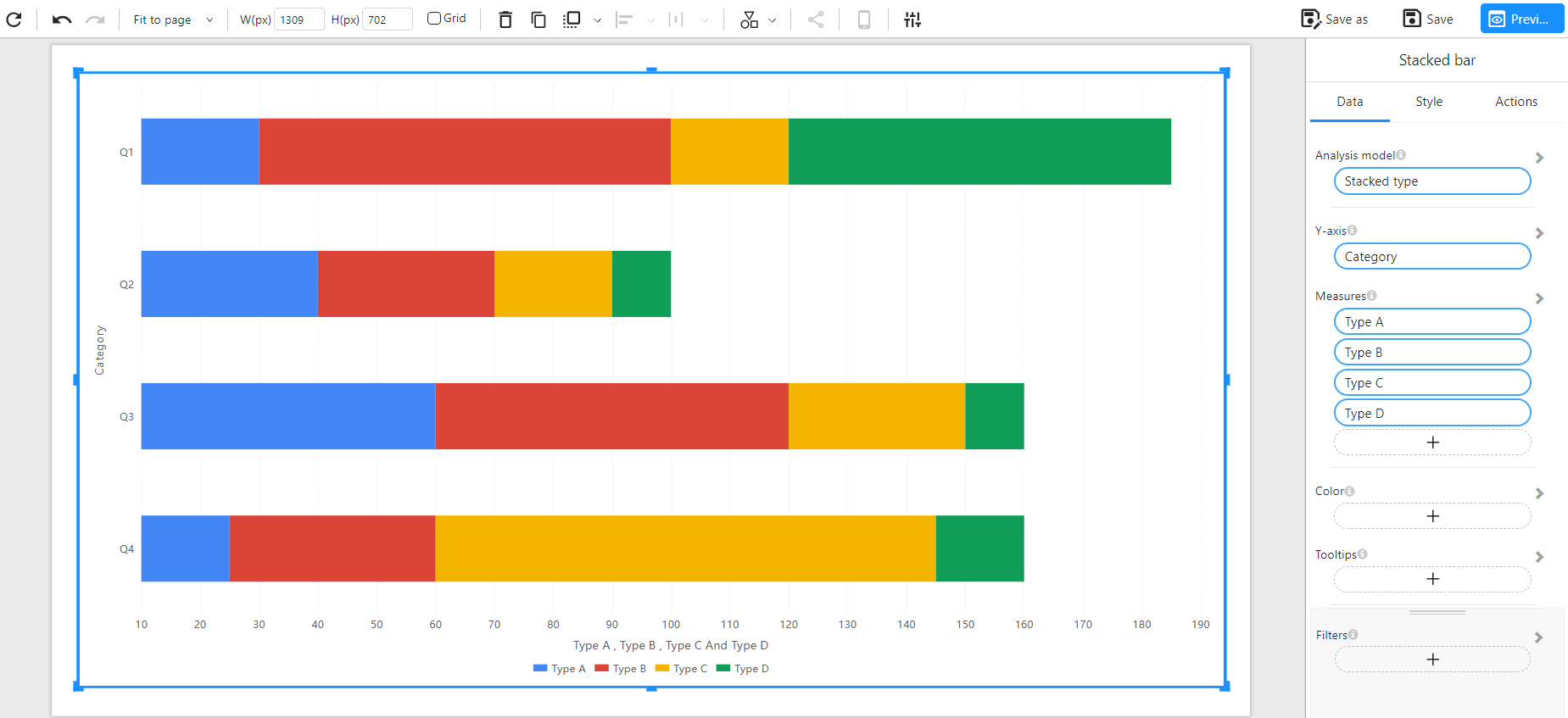
Method 1: Wide Table Format (Multiple Measures)
Each sub-category (e.g., Type A, Type B...) is a separate column, and each row represents one bar (e.g., Q1, Q2...).
Component Configuration:
- Y-Axis: Category
- Measures: Type A, Type B, Type C, Type D
Example Data:
| Category | Type A | Type B | Type C | Type D |
|---|---|---|---|---|
| Q1 | 30 | 70 | 20 | 65 |
| Q2 | 40 | 30 | 20 | 10 |
| Q3 | 60 | 60 | 30 | 10 |
| Q4 | 25 | 35 | 85 | 15 |
Chart Example:
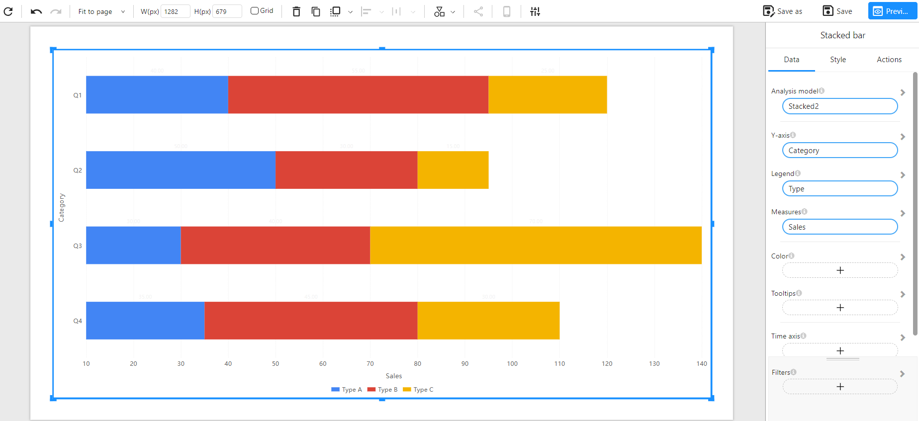
Method 2: Long Table Format (Dimension + Measure)
Each row includes a category–type pair and a numeric value. This normalized format is common in real-world datasets.
Component Configuration:
- Y-Axis: Category
- Legend: Type
- Measure: Sales
Example Data:
| Category | Type | Sales |
|---|---|---|
| Q1 | Type A | 40 |
| Q1 | Type B | 55 |
| Q1 | Type C | 25 |
| Q2 | Type A | 50 |
| Q2 | Type B | 30 |
| Q2 | Type C | 15 |
| Q3 | Type A | 30 |
| Q3 | Type B | 40 |
| Q3 | Type C | 70 |
| Q4 | Type A | 35 |
| Q4 | Type B | 45 |
| Q4 | Type C | 30 |
Chart Example:
Notes
- The total length of each bar represents the overall value.
- Colors differentiate sub-categories within each bar.
- You can enable data labels and adjust label position (left, right, inside).
- Works well for categorical comparisons, especially when category names are long.
- Supports additional options such as filters, colors, tooltips, and time axis.