Appearance
Clustered Bar
Overview
A Clustered Bar Chart is used to compare multiple categories side by side. Each category is divided into sub-groups, represented by separate bars, making it easy to analyze patterns and differences across multiple dimensions.
When to Use
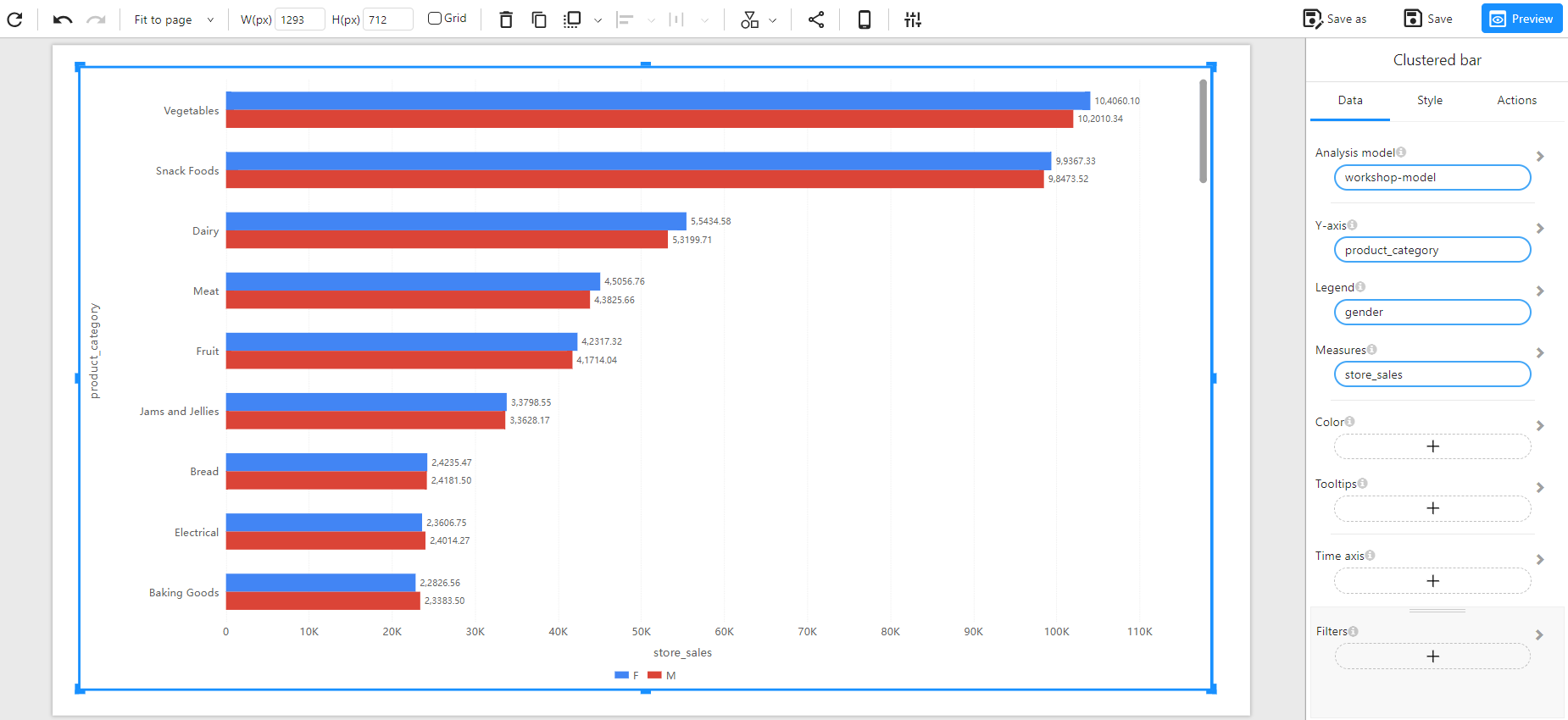
- To compare different groups within a category (e.g., sales performance by gender for each product category).
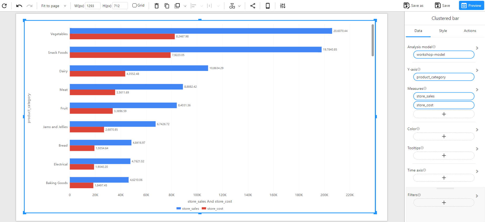
- To visualize multiple measures within the same category (e.g., sales vs. cost per product category).
- To identify trends and differences between sub-groups.
Data Structure
A Clustered Bar Chart requires:
- Y-Axis: A categorical field representing the primary category (e.g.,
product_category). - Legend (Optional): A categorical field that defines the sub-grouping within each category (e.g.,
gender). - Measures: One or more numerical fields that represent the values for comparison (e.g.,
store_sales,store_cost). - Color(Optional): Used to set the color of the chart based on categories or numerical values (intensity-based coloring, or using a categorical field for distinct colors).
- Tooltips(Optional): Show additional details when hovering over bars.
- Filters (Optional): Used to refine the data displayed (e.g., filtering by time, region, or product type).
Example Data Structure
| product_category | gender | store_sales | store_cost |
|---|---|---|---|
| Vegetables | F | 104060.10 | 82467.98 |
| Vegetables | M | 102010.34 | 0 |
| Snack Foods | F | 99367.33 | 79223.05 |
| Snack Foods | M | 98473.52 | 0 |
| Dairy | F | 55434.58 | 43552.48 |
| Dairy | M | 53199.71 | 0 |
How to Configure
Comparing a Single Measure
Comparing Multiple Measures