
Appearance
Table
Overview
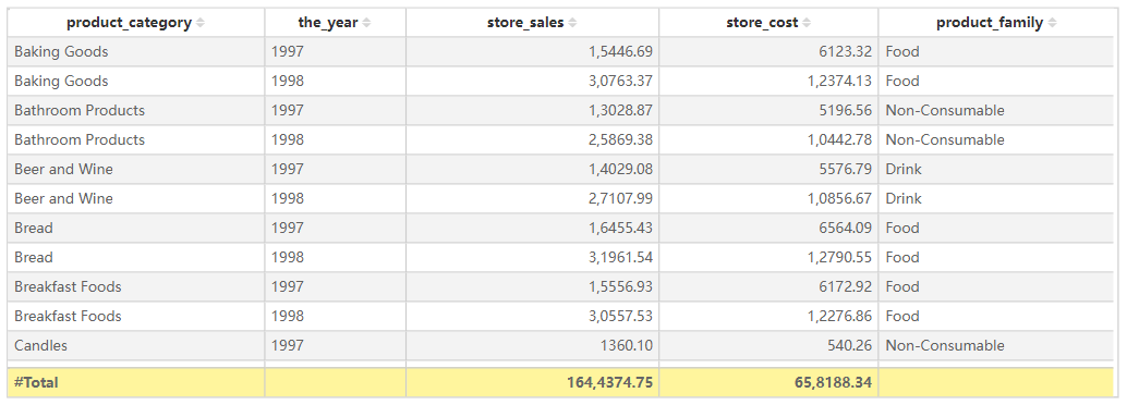
The Table component is designed to display structured data in a tabular format. Each row represents a data entry, and each column corresponds to a specific field. It is particularly useful for displaying detailed records, structured lists, and data comparisons.
Key Features
- Sorting: Click on a column header to sort data in ascending or descending order.
- Filtering: Apply filters via the filter pane or interactive slicers.
- Formatting:
- Adjust column width
- Change background color
- Modify text alignment
- Configure borders and gridlines
- Conditional Formatting: Highlight key data points using color mapping, data bars, or icon sets.
- Interactivity: Supports interaction with other visual components, including cross-filtering and highlighting.
Configuring the Table Component
1. Field Configuration
- Add the desired fields into the visualization.
- Adjust field order by dragging and repositioning them.
2. Style Settings
Title
- Display: Toggle visibility of the table title.
- Content: Enter the title text.
- Alignment: Set left, center, or right alignment.
- Font Settings:
- Font Family: Select the font type.
- Font Size: Customize the font size.
- Font Style: Bold (B), Italic (I), Underline (U).
- Background: Set the title bar background color.
Effects
- Background Color: Customize the overall background color of the table.
- Borders:
- Border Width: Adjust border thickness.
- Border Style: Choose from solid, dashed, etc.
- Rounded Corners: Set the radius of the table corners.
- Shadow: Apply outer shadow effects to the table.
Grid
- Grid Lines: Toggle grid visibility and color.
- Alternating Row Colors:
- Odd Row Background: Set background color for odd-numbered rows.
- Even Row Background: Set background color for even-numbered rows.
- Hover Effects:
- Enable Hover: Highlight rows on hover.
- Hover Background Color: Define the background color when hovering over a row.
- Row Height: Specify row height in pixels.
Header
- Header Alignment: Set column header alignment (left, center, right).
- Background Color: Customize the header background color.
- Font Settings:
- Font Family, Size, and Style (bold, italic, underline).
- Word Wrap: Enable text wrapping for long headers.
Content
- Font Settings: Configure font type, size, and style for data values.
- Word Wrap: Enable automatic text wrapping within cells.
- Column Alignment: Individually set column alignment.
- Row Numbering: Toggle row number visibility.
- Frozen Columns: Lock specific columns to remain visible when scrolling horizontally.
Grand Total
- Show Grand Total: Toggle the display of the total row.
- Title: Customize the total row’s title text.
- Background Color: Set the background color for the total row.
- Font Settings: Customize font style for total values.
Toolbar
- Display Mode:
- Always Visible
- Show on Hover
- Hidden
- Toolbar Color: Customize toolbar color.
- Extended Background: Expand toolbar background settings.
Table vs. Pivot
| Feature | Table | Pivot |
|---|---|---|
| Data Hierarchy | ❌ Not Supported | ✅ Supported |
| Cross Aggregation | ❌ Not Supported | ✅ Supported |
| Subtotals | ❌ Not Supported | ✅ Supported |
| Grand Totals | ✅ Supported | ✅ Supported |
| Conditional Formatting | ✅ Supported | ✅ Supported |
Use Cases
- Displaying detailed datasets, such as sales orders or user lists.
- Serving as a base for data exports, allowing CSV export of detailed records.
- Providing a simple and structured way to present tabular data.
- Enabling interactive filtering, data analysis, and data comparison in reports.