Appearance
Stacked Ratio
Overview
A Stacked Ratio Chart is used to represent the proportion of different categories over time or across a dimension. Unlike a traditional stacked area chart that shows absolute values, the stacked ratio chart normalizes data to 100%, making it easier to compare category distributions at different points.
When to Use
- To visualize proportional changes over time.
- To compare category contributions within a total measure.
- To highlight trends in data composition rather than absolute values.
- To analyze a single measure or compare multiple measures, similar to a pie chart.
Data Structure
A Stacked Ratio Chart requires:
- X-Axis: A date-type or categorical field representing the dimension (e.g.,
the_date (Day)). - Legend: A categorical field that differentiates the stacked segments (e.g.,
product_family). - Measures: One or more numerical fields representing the total value to be divided into proportions (e.g.,
store_sales,store_cost). - Color (Optional): Used to assign colors to different categories based on a categorical or numerical field.
- Tooltips (Optional): Displays additional information when hovering over the chart.
- Filters (Optional): Allows refining the displayed data (e.g., filtering by time, region, or product type).
Example Data Structure
| the_date | product_family | store_sales | store_cost |
|---|---|---|---|
| 1997-12-01 | Drink | 500 | 200 |
| 1997-12-01 | Food | 4000 | 1500 |
| 1997-12-01 | Non-Consumable | 1000 | 700 |
| 1997-12-02 | Drink | 450 | 180 |
| 1997-12-02 | Food | 4100 | 1600 |
| 1997-12-02 | Non-Consumable | 950 | 720 |
How to Configure
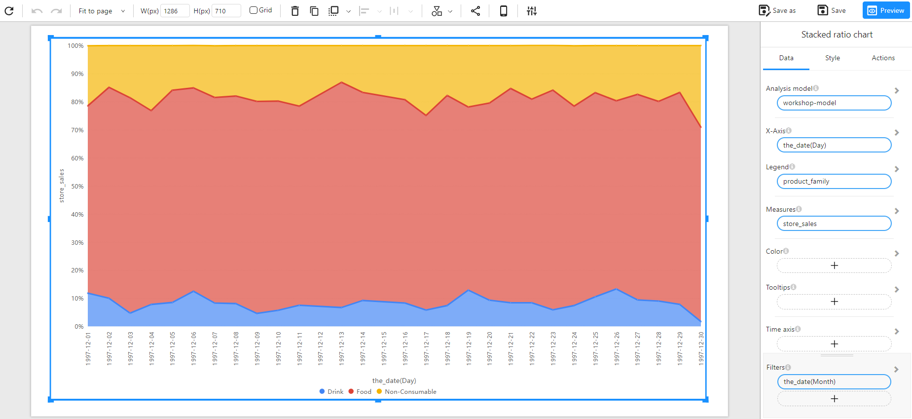
Analyzing a Single Measure
- Select the Analysis Model: Choose the dataset containing the required fields.
- Set the X-Axis: Select a date-type or categorical field (e.g.,
the_date (Day)). - Set the Measure: Choose a single numerical field representing the total values (e.g.,
store_sales). - Set the Legend: Select a categorical field to define the stacked categories (e.g.,
product_family).
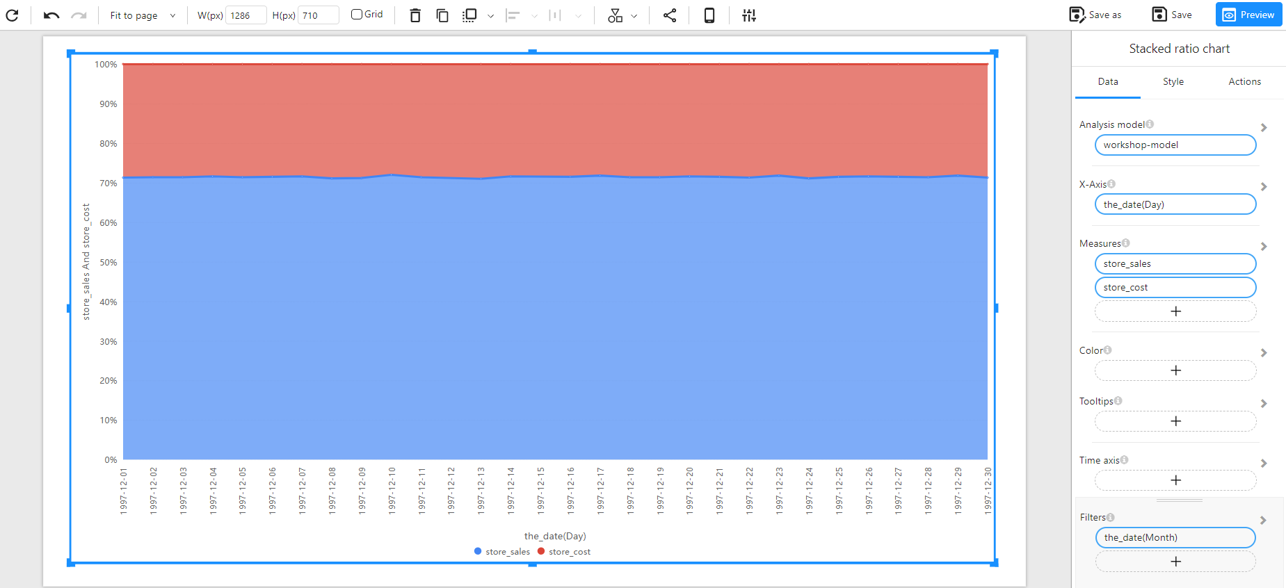
Comparing Multiple Measures
- Select Multiple Measures: Instead of a single measure, choose multiple numerical fields (e.g.,
store_salesandstore_cost). - Stack Different Measures: Each measure will be represented as a separate stacked ratio within the chart.
Optional Customization
- Set Color: Assign colors based on a category or numerical intensity.
- Enable Tooltips: Display additional insights when hovering over data points.
- Apply Filters: Refine data display using time-based or categorical filters.
Example
Stacked Ratio Chart with a Single Measure
Stacked Ratio Chart with Multiple Measures