Appearance
Progress
Overview
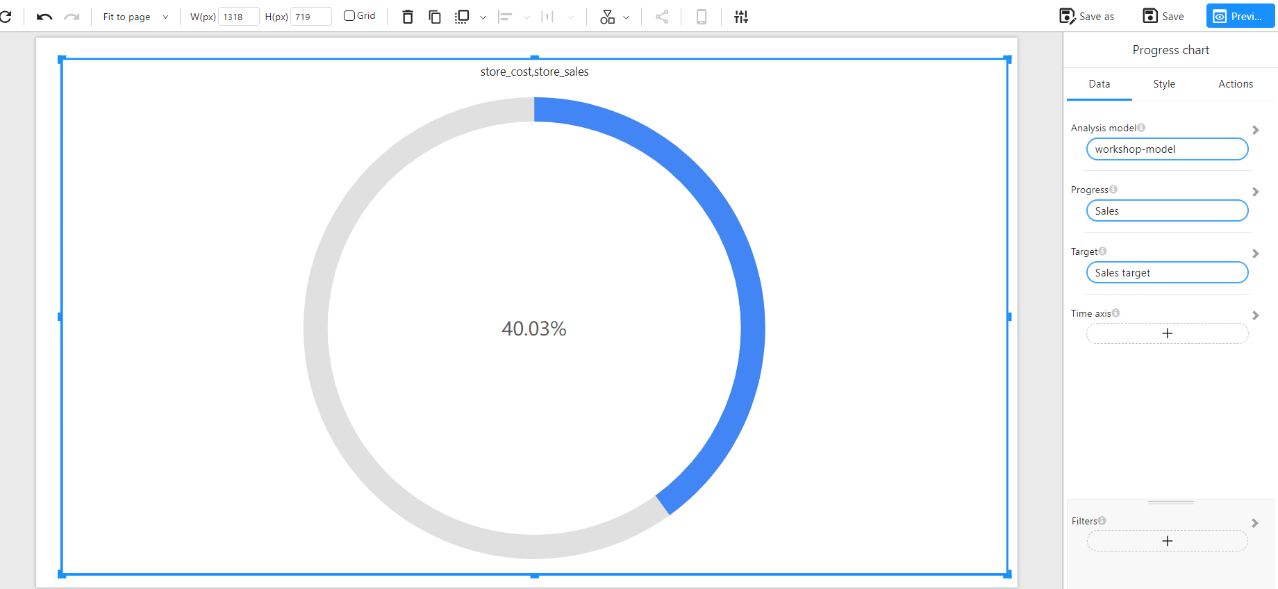
A Progress Chart visually represents the completion rate of a given metric relative to a target. It displays a circular indicator showing the percentage of progress made, allowing users to quickly evaluate performance against a goal.
This chart is especially useful in dashboards for showcasing key performance indicators (KPIs), such as sales achievement, task completion, or budget usage.
When to Use
- To track progress toward a target (e.g., sales vs. sales target).
- To highlight KPI performance with a quick, intuitive visual.
- To display goal achievement in a compact and visually appealing way.
Data Structure
A Progress Chart requires the following fields:
- Analysis model: A data model containing the metric and target fields.
- Progress: The actual value to be evaluated (e.g., Sales).
- Target: The expected or target value (e.g., Sales target).
- Time axis (Optional): A time-based dimension (e.g., date or month), which can be used to evaluate progress over a specific time range.
Example Data Structure
| date | store_sales | sales_target |
|---|---|---|
| 2024-01-01 | 12000 | 30000 |
| 2024-01-02 | 15000 | 30000 |
Example
The following example visualizes sales performance. The actual sales have reached 40.03% of the target: