
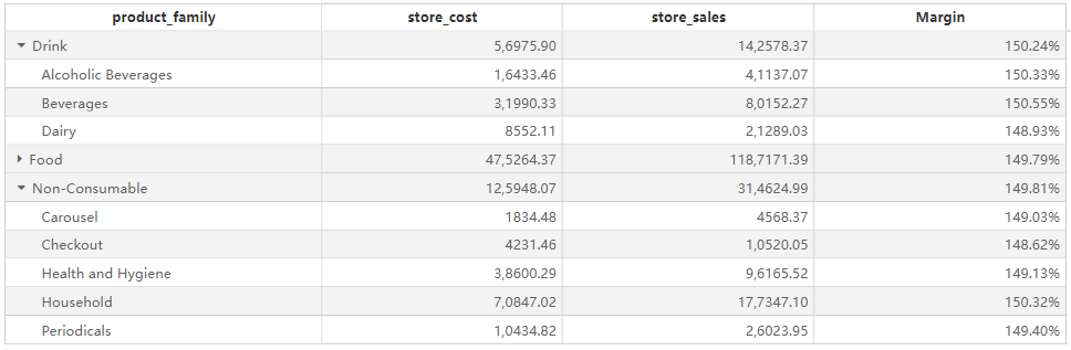
Appearance
Hierarchy Table
Overview
The Hierarchy Table allows users to display hierarchical data structures with expandable and collapsible rows. It is useful for analyzing grouped data, enabling drill-down capabilities for better insights. This component is commonly used in financial reporting, sales analysis, and inventory management.
Key Features
- Hierarchical Data Representation: Supports multiple levels of row hierarchy for structured data analysis.
- Expandable & Collapsible Groups: Users can expand or collapse hierarchy levels interactively.
- Sorting: Allows sorting within each hierarchy level.
- Filtering: Users can apply filters via the filter pane to refine displayed data.
- Aggregations: Automatically calculates subtotals and totals at each hierarchy level.
- Interactivity: Supports interaction with other visual components for cross-filtering.
Configuring the Hierarchy Table Component
1. Field Configuration
- Hierarchy Level Fields: Define hierarchical groupings by add fields into this section (e.g.,
product_family,product_department). - Fields: Add numeric or categorical fields that will be displayed as data columns.
2. Style Settings
Title
- Display: Toggle the visibility of the title.
- Content: Enter the hierarchy table title.
- Alignment: Set left, center, or right alignment.
- Font Settings:
- Font Family: Select the font type.
- Font Size: Customize the font size.
- Font Style: Bold (B), Italic (I), Underline (U).
- Background: Set the title background color.
Effects
- Background Color: Customize the overall background color of the hierarchy table.
- Borders:
- Border Width: Adjust border thickness.
- Border Style: Choose from solid, dashed, etc.
- Rounded Corners: Adjust the corner radius.
- Shadow: Apply an outer shadow effect.
Grid
- Grid Lines: Toggle the visibility of grid lines and customize colors.
- Alternating Row Colors:
- Odd Row Background: Set background color for odd rows.
- Even Row Background: Set background color for even rows.
- Hover Effects:
- Enable Hover: Highlight rows on hover.
- Hover Background Color: Customize the hover effect color.
- Row Height: Customize row height in pixels.
Header
- Header Alignment: Set alignment of column headers.
- Background Color: Customize the header background.
- Font Settings:
- Font Family, Size, and Style (bold, italic, underline).
- Word Wrap: Enable automatic text wrapping for headers.
Content
- Font Settings: Configure font type, size, and style for data values.
- Word Wrap: Enable automatic text wrapping within cells.
- Column Alignment: Set alignment for each column.
- Expand/Collapse Icons: Enable icons to toggle hierarchy levels.
Grand Total
- Show Grand Total: Toggle the display of the grand total row.
- Caption: Customize the text displayed for the grand total row.
- Background Color: Set the background color for the total row.
- Font Settings: Configure the font style for total values.
Toolbar
Display Mode:
- Always Visible
- Show on Hover
- Hidden
Toolbar Color: Customize toolbar color.
Extended Background: Expand toolbar background settings.
Hierarchy Table vs. Standard Table
| Feature | Hierarchy Table | Standard Table |
|---|---|---|
| Hierarchical Structure | ✅ Supported | ❌ Not Supported |
| Expand/Collapse Rows | ✅ Supported | ❌ Not Supported |
| Aggregations at Levels | ✅ Supported | ❌ Not Supported |
| Sorting & Filtering | ✅ Supported | ✅ Supported |
| Custom Styling Options | ✅ Supported | ✅ Supported |
Use Cases
- Displaying product categories with subcategories in sales reports.
- Creating financial reports with breakdowns by department and region.
- Analyzing inventory data with hierarchical structures.
- Generating performance reports with drill-down capabilities.