Appearance
Grouped Donut
Overview
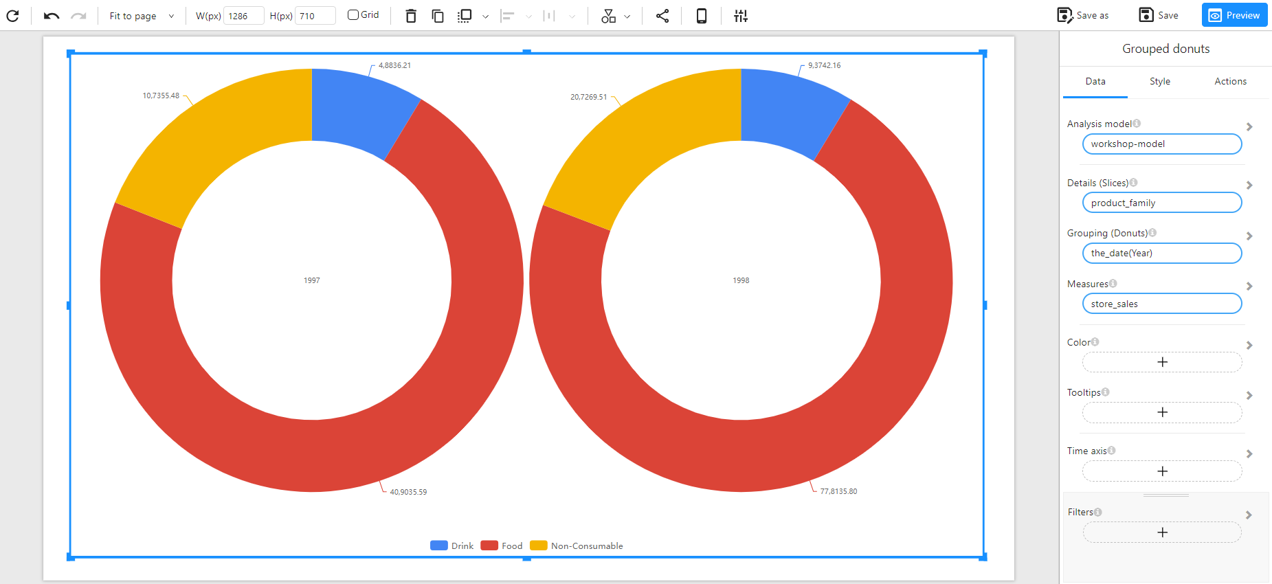
A Grouped Donut Chart is used to compare proportions across multiple categories. It displays multiple donut charts side by side, where each donut represents a different group while maintaining the same categorical slices within each.
When to Use
- To compare proportions within different groups (e.g., sales distribution by product family across multiple years).
Data Structure
A Grouped Donut Chart requires:
- Details (Slices): A categorical field defining the segments within each donut (e.g.,
product_family). - Grouping (Donuts): A categorical field used to create separate donut charts (e.g.,
the_date(Year)). - Measures: A numerical field representing the values for each slice (e.g.,
store_sales). - Color (Optional): Used to set the color of the chart based on categories or numerical values.
- Tooltips (Optional): Additional information displayed when hovering over slices.
- Time Axis (Optional): Allows for time-based filtering.
- Filters (Optional): Used to refine the displayed data (e.g., filtering by region or product type).
Example Data Structure
| the_date (Year) | product_family | store_sales |
|---|---|---|
| 1997 | Food | 40,9035.59 |
| 1997 | Non-Consumable | 10,7355.48 |
| 1997 | Drink | 4,8836.21 |
| 1998 | Food | 77,8135.80 |
| 1998 | Non-Consumable | 20,7269.51 |
| 1998 | Drink | 9,3742.16 |
Example