
Appearance
Clustered Column
Overview
A Clustered Column Chart displays values for different sub-categories grouped (clustered) side-by-side within each main category along the X-axis. This type of chart is useful for comparing multiple series within and across categories.
Unlike stacked charts, clustered charts do not aggregate values into a single bar — instead, each series retains its own bar for direct comparison.
When to Use
- To compare multiple series across a shared category.
- To highlight relative performance of sub-categories.
- To avoid stacking when aggregated values are not meaningful.
- When the goal is to preserve series independence visually.
Data Structure
Clustered Column Charts support two data formats:
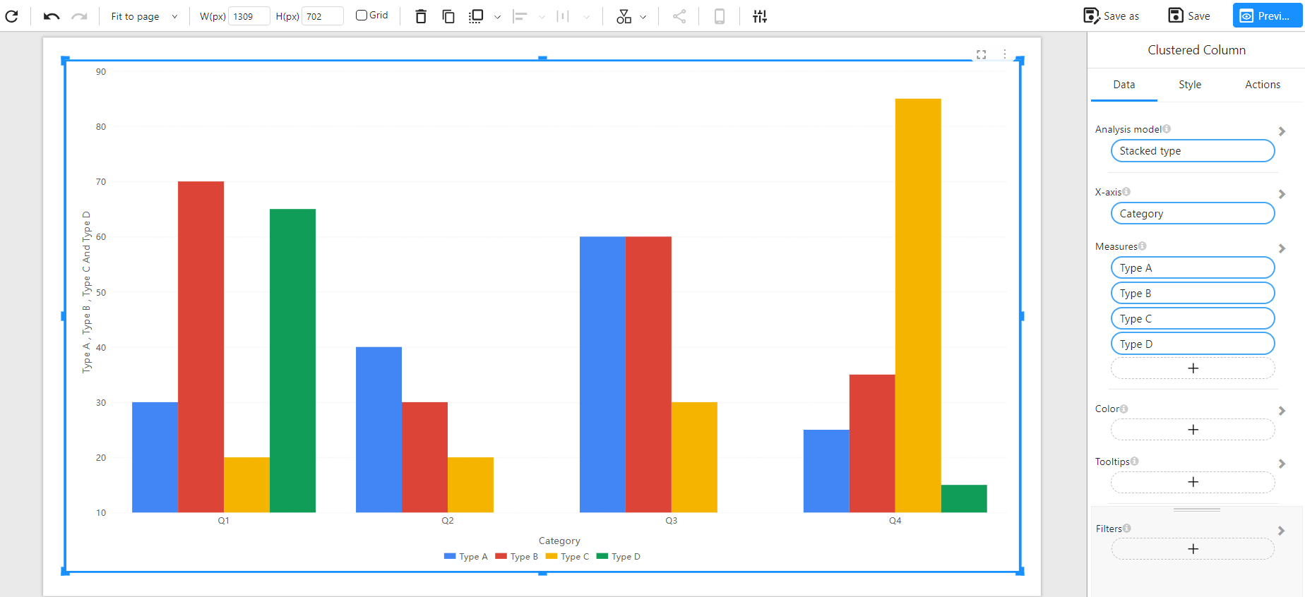
Method 1: Wide Table Format (Multiple Measures)
Each sub-category (e.g., Type A, Type B...) is stored in its own column. Each row represents one main category (e.g., Q1, Q2...).
Component Configuration:
- X-Axis: Category
- Measures: Type A, Type B, Type C, Type D
Example Data:
| Category | Type A | Type B | Type C | Type D |
|---|---|---|---|---|
| Q1 | 30 | 70 | 20 | 65 |
| Q2 | 40 | 30 | 20 | 10 |
| Q3 | 60 | 60 | 30 | 10 |
| Q4 | 25 | 35 | 85 | 15 |
Chart Example:
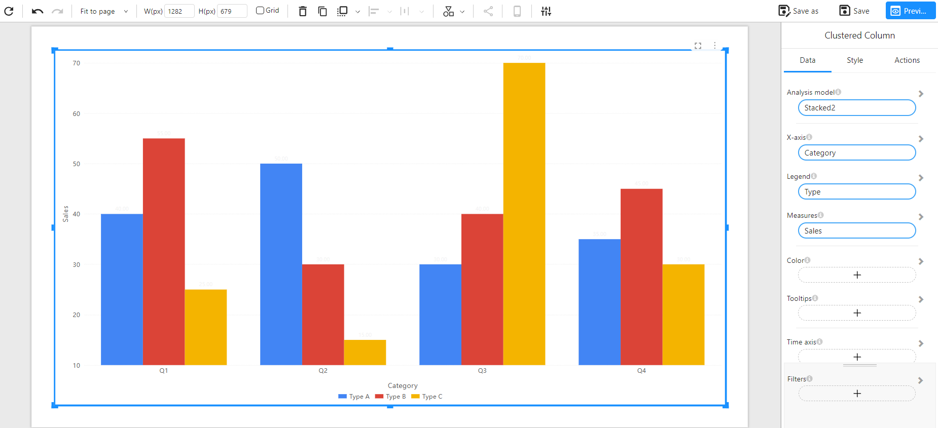
Method 2: Long Table Format (Dimension + Measure)
Each row represents a unique combination of main category and sub-category, with the corresponding measure value.
Component Configuration:
- X-Axis: Category
- Legend: Type
- Measure: Sales
Example Data:
| Category | Type | Sales |
|---|---|---|
| Q1 | Type A | 40 |
| Q1 | Type B | 55 |
| Q1 | Type C | 25 |
| Q2 | Type A | 50 |
| Q2 | Type B | 30 |
| Q2 | Type C | 15 |
| Q3 | Type A | 30 |
| Q3 | Type B | 40 |
| Q3 | Type C | 70 |
| Q4 | Type A | 35 |
| Q4 | Type B | 45 |
| Q4 | Type C | 30 |
Chart Example:
Notes
- Bars for each sub-category are rendered side-by-side within each main category group.
- Colors are used to differentiate sub-categories.
- Enables direct comparison between sub-categories without stacking.
- Supports tooltips, filters, and style customizations.